Two charts - the scale of government from 1969 to 2008
Mark J. Perry at
Carpe Diem has some interesting data about levels of government employment.
Here is one of them:
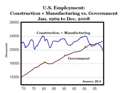
Read the article for the rest -- a really interesting (and sobering) look given the decline of US manufacturing and the increasing socialist tendencies of our government.
The next four years will be interesting...
Posted by DaveH at January 21, 2009 9:41 PM
| TrackBack