Synthstuff - music, photography and more...
Occasional notes from a Mt. Baker Geek...
« Gojira: Fainaru Uozu
|
Main
|
The legal side of the Religon of Peace »
November 9, 2004
Weekend at Yasser's
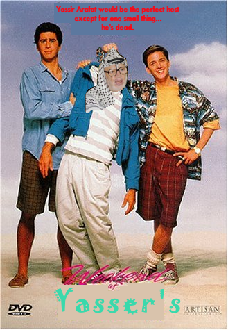
Shamelessly
stolen from here
Posted by DaveH at November 9, 2004 9:41 PM