February 11, 2014
Something to consider - a chart
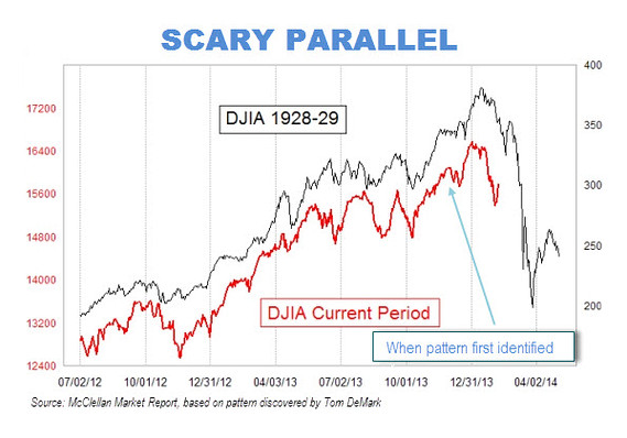
From Mark Hulbert writing at the Wall Street Journal's Market Watch:Scary 1929 market chart gains traction
There are eerie parallels between the stock market�s recent behavior and how it behaved right before the 1929 crash.
That at least is the conclusion reached by a frightening chart that has been making the rounds on Wall Street. The chart superimposes the market�s recent performance on top of a plot of its gyrations in 1928 and 1929.
The picture isn�t pretty. And it�s not as easy as you might think to wriggle out from underneath the bearish significance of this chart.
Comments
Post a comment